
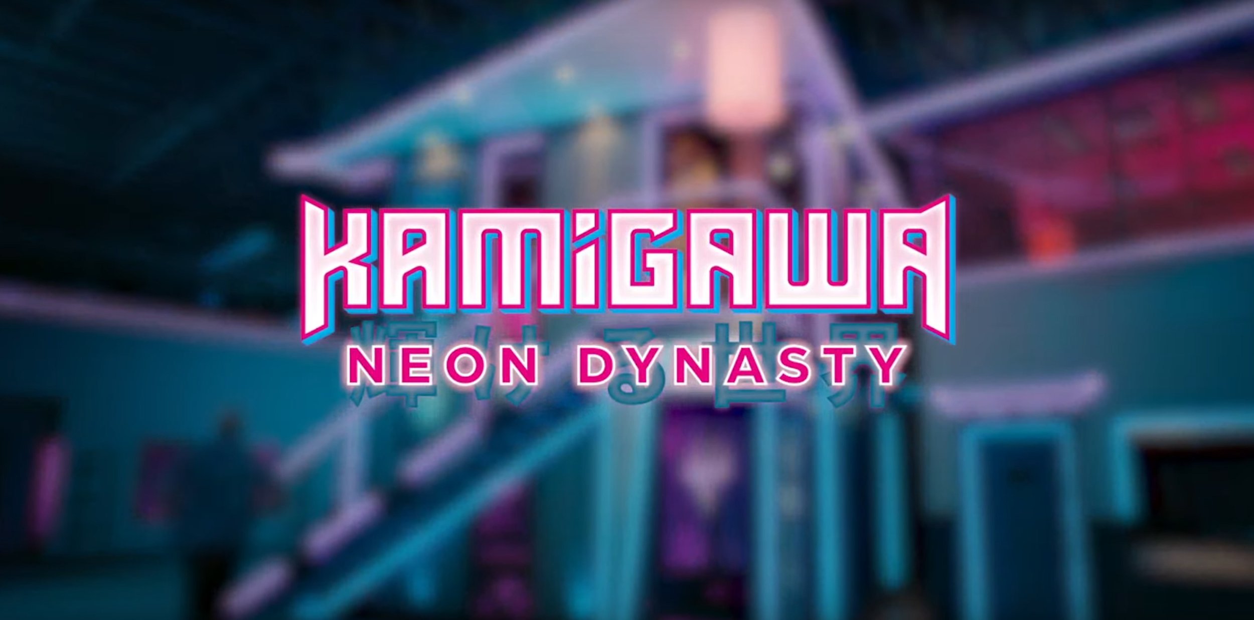
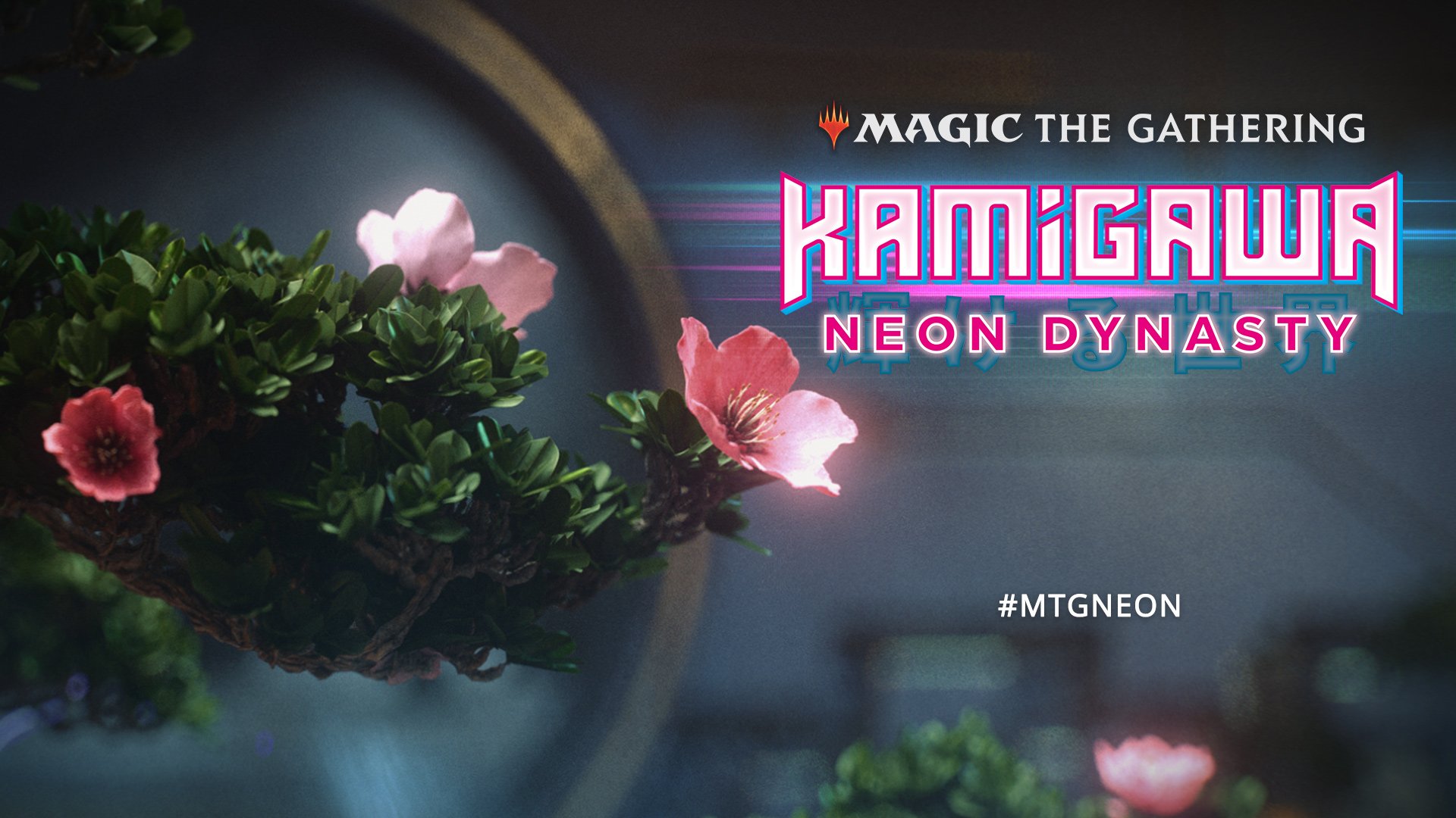
For Wizards of the Coast’s Kamigawa Neon Dynasty I had the honor of defining look and feel for Neon Dynasty’s campaign look and feel. This sets aesthetic intersects perfectly where I stand, a mix of cyberpunk and glitch, future and tradition. So it was a labor of love drive this aesthetic to be used across the entire marketing campaign as one cohesive campaign look and feel.
The brief


We began by defining what Neon Dynasty is, and what it isn’t. It is optimistic, light, fashion forward, bold and confident. It isn’t dark, ironic, dystopian or noir. Exploring these themes, the team began to define the language of the type treatments we’d use, the colors pulled from cherry blossoms, neon, and technology. We made sure to steer clear of design language that pushed concepts towards darker cyberpunk treatments and connections.
Exploring the space
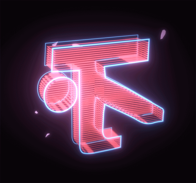
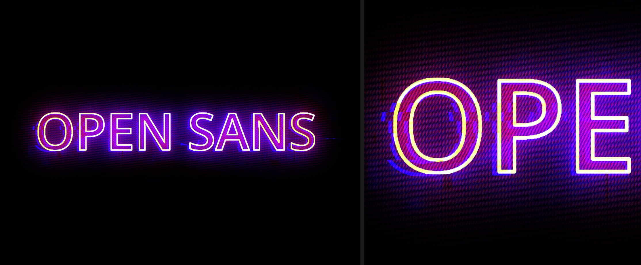
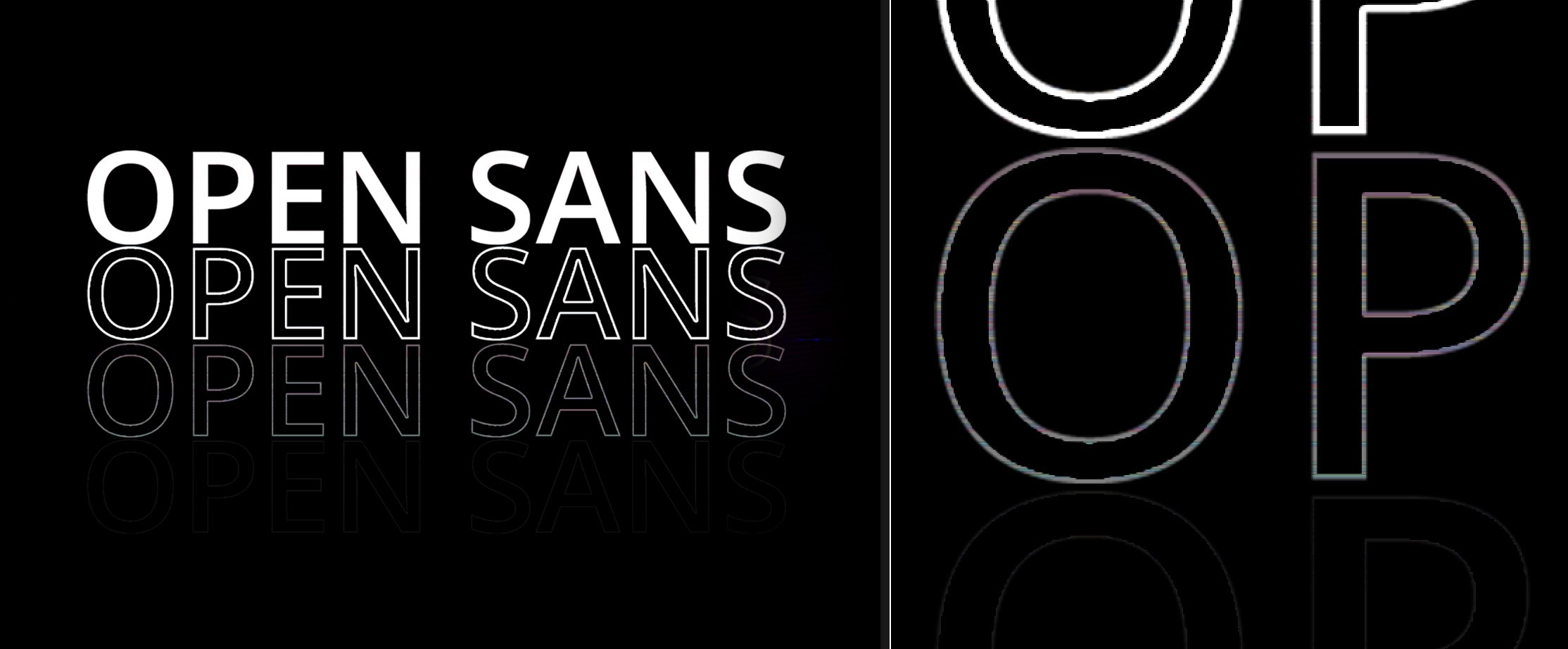
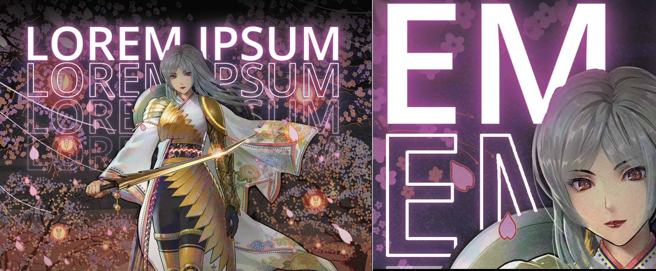
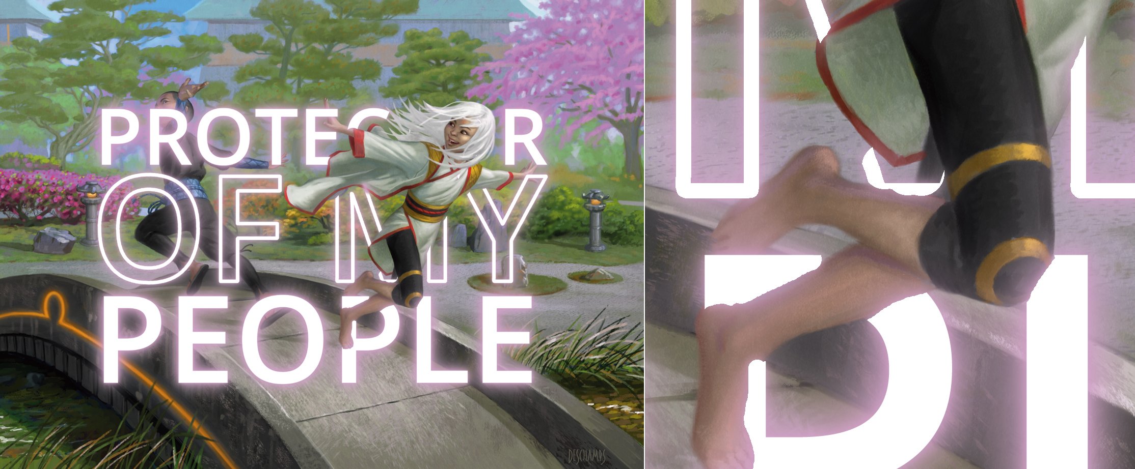
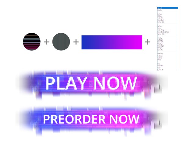
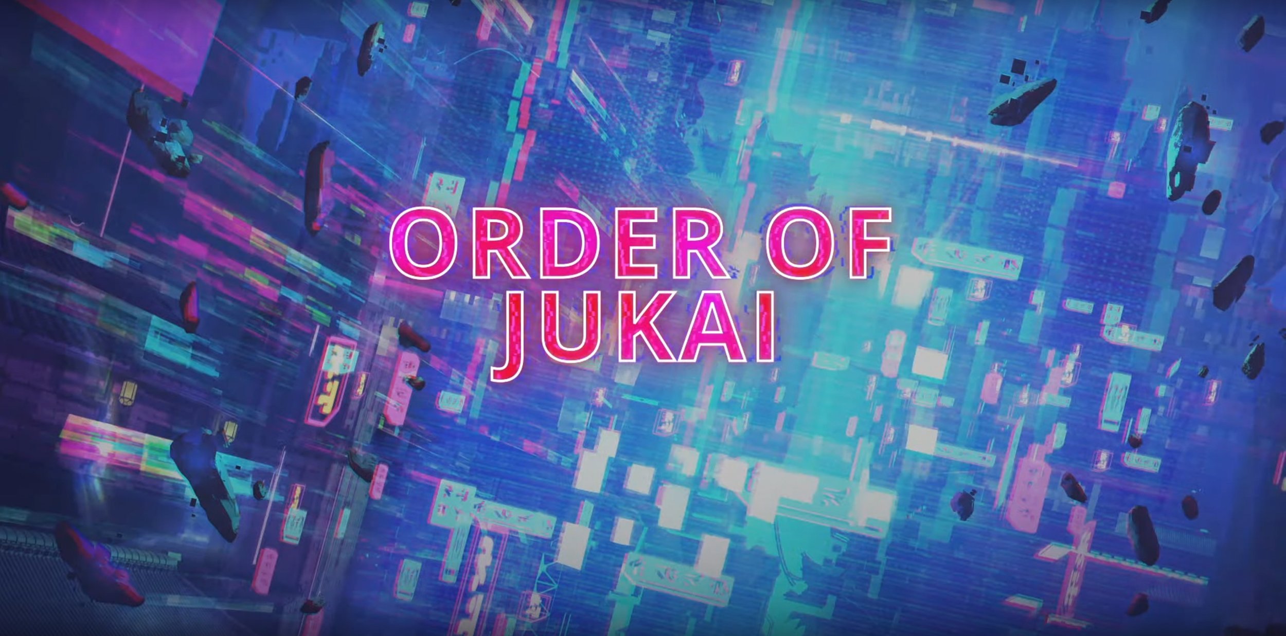
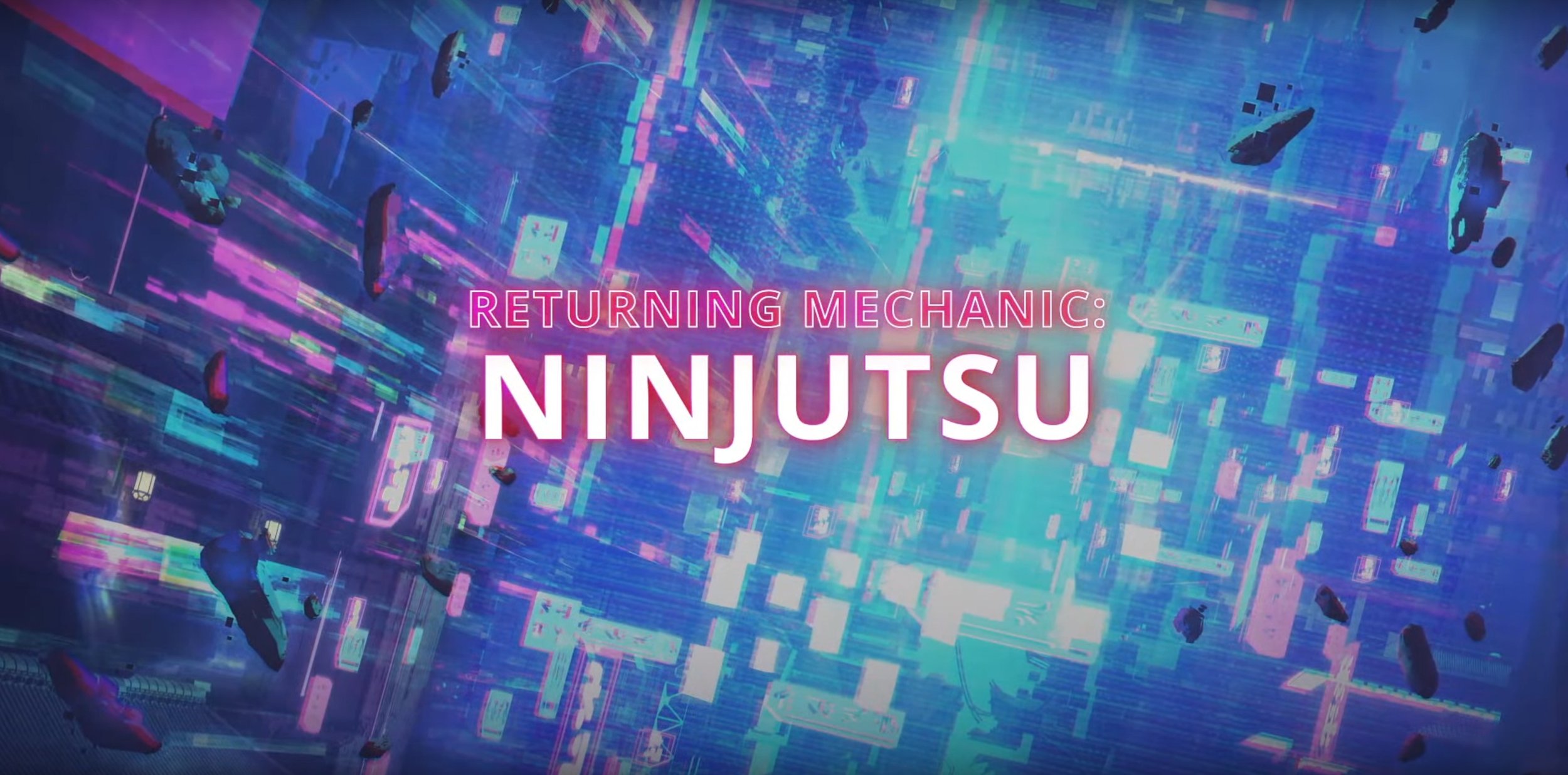
Early explorations were iterated on, refining the elements exploring how technology interacts with art, fashion, and color. Exploring some of the emotional themes of memory, optimism and the boldness of breaking from tradition. We also explored the idea of taking basic components of technology, and breaking those elements down, to primatives and pushing those into the fiction of Kamigawa. Things like LCD panel patterns, holographic neon light bending are just a few of the ideas explored.
EXECUTIONS
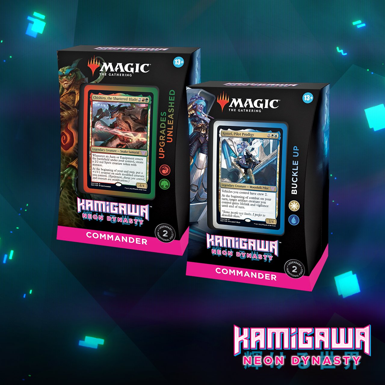
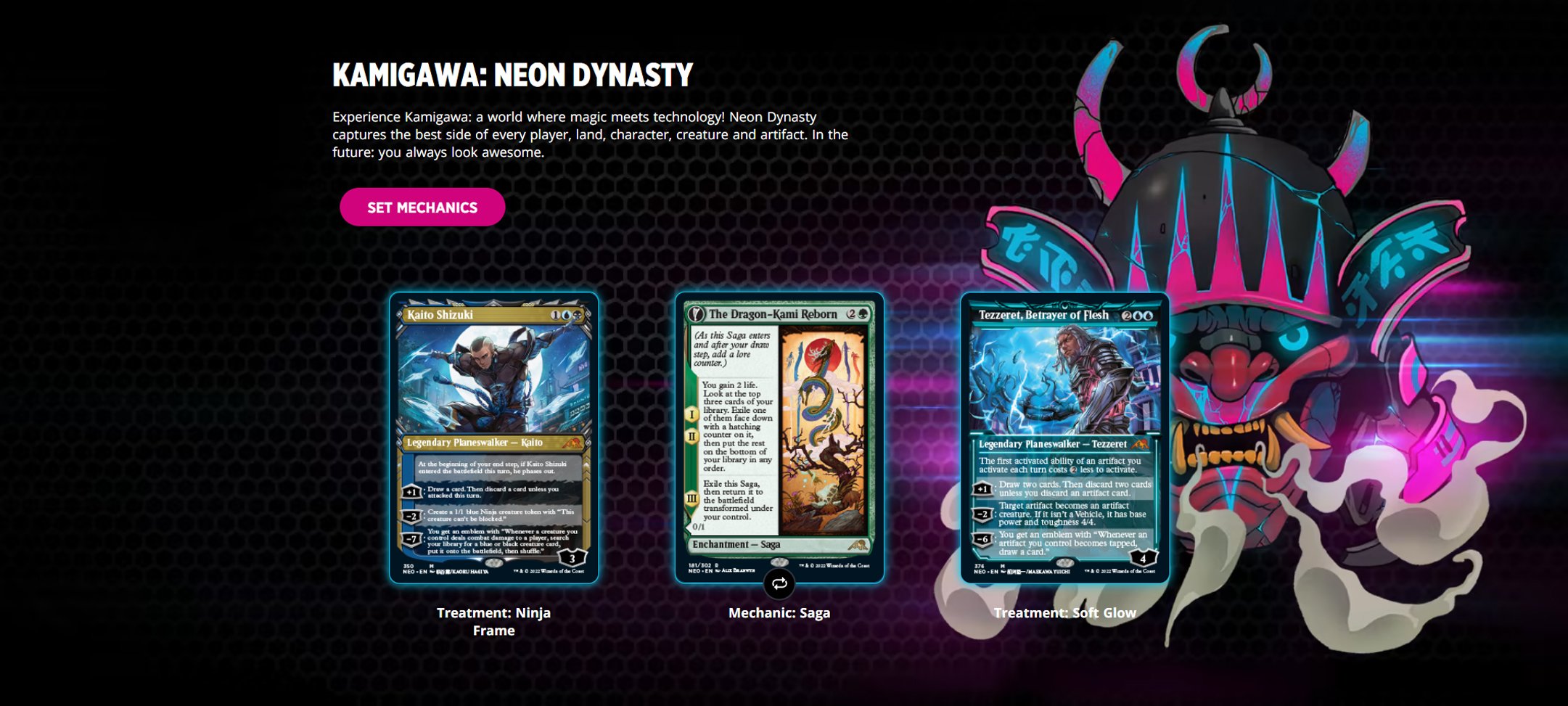
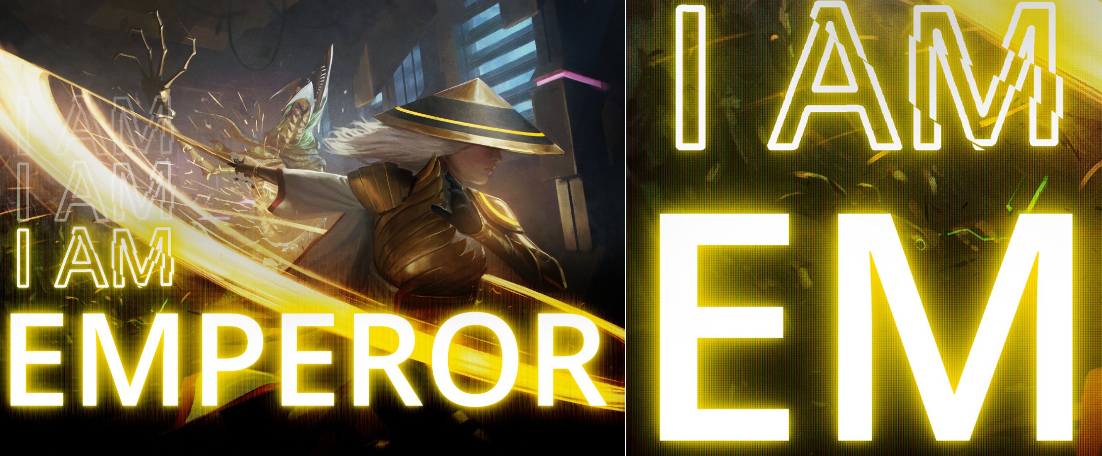
This was a new process for the Creative Marketing and Design team, and the outcomes have been called “The most cohesive campaign we’ve ever run.” and I’m proud to have been a part of it. This is now the standard of how these campaigns are done, and i think the results speak for themselves. Below are the various places where you can find these executions out in the wild.


